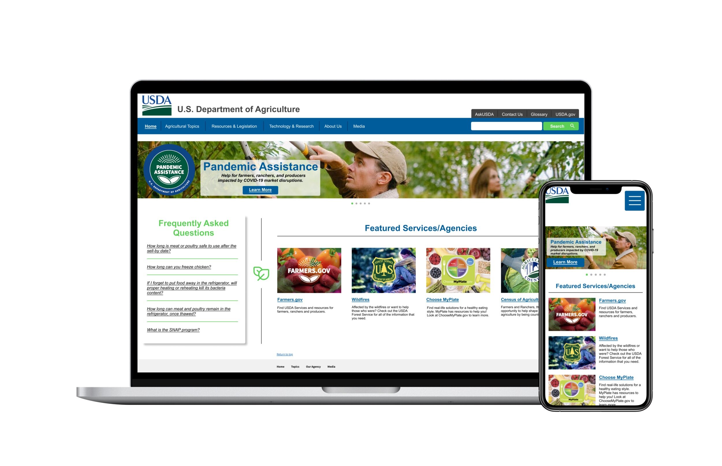
U.S. Department of Agriculture Site Redesign
My Role & Responsibilities:
UI Analysis
Usability Testing
Sitemapping
UI Design
Website & Mobile Prototyping
Other Members: N/A
Timeline: 3 Weeks
The goal was to analyze and redesign the U.S. Department of Agriculture’s site, including identifying navigational issues, increasing visual appeal, and reorganizing the information to suit the user’s needs.
Proto-Persona
Before conducting interviews, I built a proto-persona of who would potentially use the site. This is how I came up with Steve, a multi-generational farmer.
UI Analysis
I also conducted a UI Analysis of the site, redlining sections and determining some of the pain points. One of the main ones was the fact that the navigational bar had too many subtopics under each tab, which could get confusing to look at. While the heuristic evaluation showed that it was accessible, the site was quite plain and boring to look at.
User Testing
From the usability testing, I made an affinity diagram to group out certain concerns made by individuals over the site. A main takeaway was that the navigation needed to be made more clear and efficient.
Here is the 2x2 Matrix that I made from the affinity diagram. The following are some of the most important changes that needed to be made:
• Solving homepage navigation
• Increasing interest while keeping simplicity
• Reorganization of navigational bar subjects
Card Sorting
The card sorting process was super important for the redesign process, especially when it came to breaking up the main tabs of the site into a few more options for users to interact with.
Moodboard
This is a mood board I created based on the user testing as well as the existing style guide for the USDA site. The colors were drawn from and/or inspired by the current USDA logo and the symbols that I found were simple, yet nature-inspired to carry on the vibe that the users wanted.
Style Guide
Here is the full style guide that I completed for this site redesign, including components I used within the design. It really drew on the natural colors and shapes of the mood board, but still continued on with a clean, modern feel.


